Showing posts with label stampotique challenge. Show all posts

9 May 2013

Stampotique Designers Challenge SDC99 Summertime


 The Stampotique Challenge set by Carol was Summer but as I live in Scotland which does not always have bright days I was thinking about the colours of the West Coast of Scotland. Photos are probably the easiest way to show how this came about. The journalling says "As the sun sets the Selkie comes out to lure the unwary to a watery wedding...". Selkies are are a Scottish myth and are sea creatures that are seals in the water and beautiful people on land.  I thought my Stampotique Mermaid added a more sinister twist. I began by creating texture using gesso.
Then using watercolours created the landscape.
I added Titan White and Buff
Stamped texture in the distance using Angel Wings...

Stamped the mermaid, coloured her and placed her on a "rock" cut her out and added her and journalling to the page.


11 February 2013

Messy Textured Journal page


This page is for Lens Guy who puts up with a lot and as I don't do Valentine's this is it and he really is "For Keeps and Forever". It is my entry into the Stampotique Challenge SDC86 Red, Pink and White and the Simon Says Have a Heart Challenge. I am fascinated by creating texture on my art journal pages at the minute so I began with some texture paste through chipboard waste and by splodging a heart shape on the facing page with my finger.
 I then pressed a sheet of corrugated card on top to create ridges (and impatiently waited for it to dry and getting fed up I sprayed some Dylusions inks onto the damp paste). There was also some alphabet stencils under the heart in gesso from a previous use up of waste paint.
As I had been sewing I decided to sew a border onto the page as well. I stuck masking tape down the centre, a tip I picked up from Donna Downey as many of my previous pages have ink incursions from later pages and this helps contain seepage between pages and is hidden once the page is finished.
I then used 3 dylusion heart stamps on the page facing the big heart and as a border round both pages which I highlighted with more watercolour paint in red and pink, ink and white acrylic paint. I then stamped Oh My Deer and Eric (from Stampotique) 3 times onto white tissue paper and glued them onto the page. For two of the images I went in with red and pink watercolours and blended them into the page and the third one I left the stamped images uncoloured and ghost like.
Close up showing stitching, doodles and traces of the alphabet stencil.

Lots of hearts and texture.

Thank you for dropping by.


3 February 2013

Journal Page SDC85 Whatever Makes You Happy


Kaz created the challenge for this week's Stampotique challenge;"We all have our problems in life, but life is short and we should all find something to put a smile on our faces as often as we can. So whether you choose 'happy' as your theme, your word or you use a technique that makes you smile, show me your little bit of HAPPY!"

I did wonder about this as I am normally pretty happy but the last few months have been tough. Then middle son's motivating phrase "Positive Mental Attitude (PMA)" which is a family joke came to mind and the song lyrics "Be happy, don't worry". Lying in my sick bed I had been rereading some old magazines and in August 2012 Craft Stamper; Jaine Drake had an article about using old pieces of chipboard and texture paste as the base for a journal page. As one of my intentions this year is to use up arty and fabric stashes this seemed like a great way to use some of those early purchases like peel offs...
I found some peel offs, chipboard and letters and added them to a gesso base. I then put texture paste on top of these pieces and more gesso followed by some dylusion inks and distress stain.
At this point I was pleased although those large letters don't really keep their appearance with layers and the peel offs were much better. Then it went wrong...
I had an idea about using glossy accents and embossing powder and I hated it. I grabbed some alcohol thinner and rubbed it off (was not set yet) and gessoed over the offending pieces. I then added stamps from a number of Dylusions' sets that I stamped on dictionary pages and card,  journalling and more doodles. It was still a bit lacking in cohesion so I stamped Claudine Hellmuth dots over the whole page. When I was sticking the stamps on the page I used Golden Soft Gel medium (semi gloss) as it was all I had and noticed it made the colour much brighter and reacted with the distress. In the end I used my finger to add gel medium all over the page. I added journalling on waste sprayed paper and finished my page. It does show that if you make a hideous mistake in a journal you just get the gesso out and keep going until you are happy...
I had taken more photos but the gel medium has a slight sheen and the close up pictures did not really work.


13 January 2013

Art Journal Stampotique Challenge SDC82

Stampotique stamps, paint, layers, tonic border punch and snowflake punch


The first pages using Dylusion and Studio 490 stamps and tonic border  punches and the lyrics from "Brain Damage" by Pink Floyd. 
 I am entering this in the Stampotique Challenge SDC82 which challenged you to use die cuts and punches. I finished the page but found it very hard to photograph, partly because the "page" is a double page layout with another double page inside that double page. I also used lots of mod page to stick all my layers together which gives the page a high shine. I think this page is perhaps too much and is one of those pages when I should have stopped about 4 layers back but I still like all the layers and texture.
These were the pages before I went a little overboard...

I like the snowflakes I added but think I should have left the text and the waste from the punches white.
I suppose that is the fun of journalling you never quite know what will happen. I like the fact that other pages of my journal will have the cut out shape and you can glimpse areas through the punches.
Thank you for stopping by.


21 October 2012

Stampotique SDC70 Backgrounds Art Journal

I have been doing a little journalling this week and again it is a little "dark" to reflect what is going on in life.
The Stampotique challenge SDC70  was to use a stamp to create the background. I began with some scribbled words, paint and ink. Then I used TH mask and Dylusion inks.

Next I used a clock face stamp and a mask of Olivia to create a sense of chaotic time. When I then stamped Olivia she seemed lost so using acrylic paint and fingers I lightened part of the page. I then masked and sprayed again.
I liked how her face was now ghostly and left that on the original page but stamped and coloured a headless version of her. I then used the tube of paint to create circles in the clocks.


I added some red watercolour spirals and my journaling about Time and my lack of control over it.
The reason for this is my poor mum who has been in hospital for many weeks. This week she developed an infection and had another op to remove the hip replacement. She will be without a hip for 6 weeks and on IV antibiotics before she has her fourth op to replace the hip. Unfortunately she will need to stay in hospital all this time - but at least they have no identified the problem.
I am trying to stay positive but after it could be a lot worse. Thank you for dropping by.

22 April 2012

SDC52: Oodles of Doodles

I created this tag for the Stampotique Challenge here, set by Kaz Boughton that asked for oodles of doodles. I have been experimenting with creating a wood distress finish for another finish and on this tage used layers of distress stains and titan buff acrylic paint for the background. I stamped Smushasha onto the tag and then coloured her with watercolour promarkers. I doodled the title "Sometimes life's a beach" with gel pens and posca white and then doodled the seaweed over the stamped image.
I then added some of my large collection of sea glass and beach finds and some seam binding. To hang the tag I threaded ribbon through a holey shell.

My imac is having memory problems at the moment as I have too much stuff on it and even though Lens Guy set up a hard drive for me I haven't quite got round to moving stuff onto it. There is always something more interesting to do...


4 March 2012

SDC49 Purple Pink Black Art Journal Page

Two posts in one day - I have been having fun all day. The latest Stampotique challenge is to use Purple, pink and black. This page is about how I feel discombobulated - this was my eldest son's favourite phrase for many years and it is just how I feel today. (Even if I did miss out two letters on the page. I only noticed this just now and the page is fixed but it is too dark too take a picture of the word fixed.)
I used Stampotique's Oh Dear, Angel Boy and Olivia stamped several times on card and cut up to create new odd images to reflect the feeling. The background began with masks, gesso and pink and purple dylusions paint.
I added the watercoloured stamps
I then doodled a border around the edge. Maybe I should have left it there after my journalling...
 but I added a layer of sprayed black and pink inks and then paint applied with a credit card and some black lines around the stamps.
I am also altering a box for the February challenge on UK Stampers but it is going very slowly - two weeks and counting but here is sneak peek of the box in progress.


4 January 2012

Stampotique SDC 45 Challenge


I have finally finished my 2011 art journal and my last page is my wish for the New Year and my entry to the challenge. It's the last page in my journal, is double sided and has a flap for some secret journalling and reflection on my journal. My wish is more a comment on the art journalling process.
The first page uses Olivia, Oh Dear and Eric. I created a background using pink and orange dylusion paints and inks (on a gesso base layer) and then added extra detail with Teal. I stamped the figures onto card and coloured them using Wild Honey, Marmalade, Barn Door and Worn Lisptick distress inks and stains.
I coloured three postage tags with Dylusions white and teal paint and then sprayed poemegranate ink on top. I stamped Eric, Olivia, Angel Boy and Fran in blue Stazon across the tags. The other side of the tags is for my secret journalling. They fit inside the pocket under the flap.

 The photo below shows the flap open with the tags inside.

The other side of the page was given a layer of gesso and then I applied teal and pink Dylusion paints with an old credit card. I stamped Smushasha and Angel Boy and coloured with Distress inks. My wish or new goal for 2012 is to continue with art journalling and I now have a book to do it in rather than random bits of paper that I had to wonkily cut to size.


 Those of you that follow the fab Kate Crane will appreciate that these pages have been influenced by her style.
I am going to create another post today which shows the completed journal which I am so pleased with.

2 November 2011

Stampotique Altered Poison Bottle


At Stampotique Maria challenged us to alter a bottle to a poison bottle and only use Stampotique stamps... hmmm... much thinking ensued. Here is the almost step by step approach, it just leaves out the  swearing, smiling and general messiness that went on. 


I began with an empty perfume stick bottle which I filled with  sploshes of alcohol inks and gold mixatives but I found it hard to get it to go where I wanted it to go.

I coloured the lid with pro markers and alcohol inks and doodled some details on the lid with sakura white and glitter pens. It is a poison bottle but it also needs an antidote which I created and stuck to one of the perfume sticks.
In my bits and bobs box I found an old dried chilli and that seemed a great antidote to poison when wrapped with beads, ribbons, pin and the definition of antidote. I had to really think about how to get the stamping on and then staring at the glass bottle inspiration stuck - shrink plastic. There was a lot of unladylike cursing at this point as bits curled over too much and got stuck etc but I finally ended up with these pieces edged in alcohol ink.
Angel Boy, Oh Deer, Smushasha and Olivia (Eric had a major melt down and curl up)
I decided the bottle needed a stand so found the plastic protector from a stack of cd's added ink and stuck on some metal fasteners as feet. If I had taken photos in daylight you could appreciate how giving the bottle a base that is raised up helps the colours bounce. I then stuck my shrink plastic stamps to the bottle with glue, masking tape, glue dots, tape and more swearing as a curvy bottle and wavy shrink plastic make it tricky to stick. I also added another layer of ink to my shrink plastic.
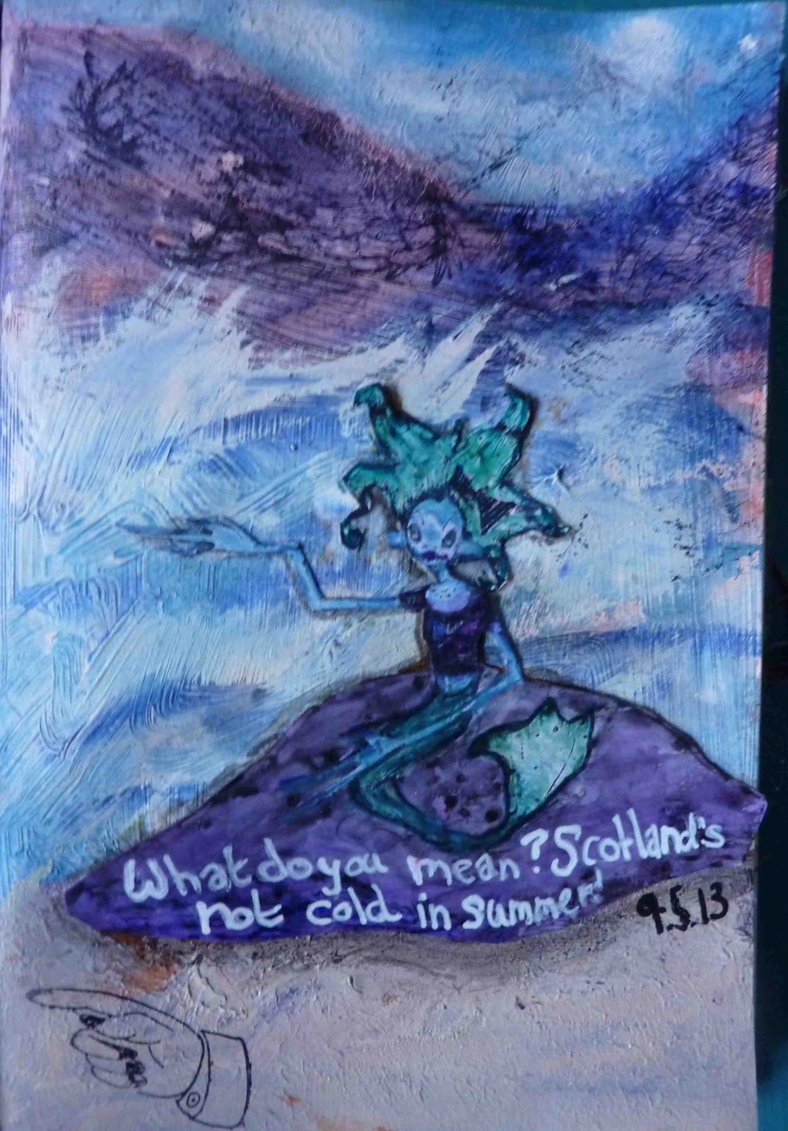
Olivia perhaps suffering from Poison?
Angel Boy hiding under what began as a hideous flowery chipboard tag  before I covered it in gesso,  inks and my drawing of a wonky skull and crossbones - and another bead from that box.
  
Here you can see the shrink plastic poison charm above Oh Deer and a key and owl charm that were dipped in alcohol inks and added to the sign.

The curved bits hanging from ribbon on each corner are from a broken shell necklace in my bits and bobs box that I dripped red ink onto to make them look a little like blood. I enjoyed making this. I hope you enjoyed reading about it.