27 February 2012

Art Journal and more image transfers

This time I followed the fab and easy to use instructions from UKS and created image transfers by layering on 8 layers of gel medium  and then letting it dry and soaking paper off. Intriguing results and more experiments to come. This page began with modeling paste and then layers of acrylic paint in pink, red and yellow and some ill advised adirondack pearl dabber. It was bright and vibrant but I hated the pearl dabber...
Gesso to the rescue. My images come from a book on North West Pacific First Nation Art. I am fascinated by this art and always wanted to learn how to create images like this. The transfers were created by adding about 8 layers of Golden Soft Gel (Semi Gloss) medium in alternating directions. Once dry I soaked the paper and rubbed it off. They were then stuck down with more gel medium.
They are slightly shiny but see through.
I then stamped a number of birds from The Birds on a Wire Dylusion stamp set.


And then began to doodle my journalling. In real life there is not such a contrast in colours between the image transfers and the rest of the page. The journalling is about the fact that I don't get Twitter and can't see the point of it even though I am pretty tech savvy.
The gel medium swirled around so I thought my journalling should too. I then created a border around the pages of 140 black blocks and added a number to each to represent the 140 characters allowed in a tweet. 
Another finished page.


22 February 2012

Getting my scrap on at the crop

I had a very productive time at the monthly EK Craft and Crop  and completed the pirate and circle lo  and them came home and completed the Beach Babe lo. These are all using photographs that used to be part of photo montages in clip frames. This was before I had ever heard of scrapping. The frames eventually fell apart and I had a pile of very random photos - none of which have dates or places on them and I have been racking my brain to remember exact details about them.
The Beach Babe lo used the UKS February Simple Recipe of citrus orange, fuschia pink, turquoise and red with mists and buttons. I misted a TH Resist page with orange/pink dylusions and then used blue/green on white to make the central panel. I punched flowers from the waste and added bling to their centres. The ribbon, flowers and button continue the colour theme.
The second page was made up of the blue/green card stock and then a page from my stash that was just too bright to use all together so I cut it up and used Heather's circle dies.

 The last page was for the weekly challenge and had to include red and black, stamping (Dylusions fab skull) and movement courtesy of a movable journalling tab. I borrowed the bunting punch and in a charity sale to raise money for Help the Heroes bought the scrabble tiles.
At the crop the lovely Heather made me think about journalling on los as she pointed out that in 100 years time (or less) people could look at the photos and have no idea about who, what, why, place etc so I am going to try and remember to include journalling on all my los in the future.

19 February 2012

Experimenting with image transfers

I have spent most of today trying out different methods of image transfer. I set the monthly challenge on UK Stampers to use an image transfer and your stamps in a different way to make a piece of art. I am well and truly "Hoisted by my own petard" as I am really struggling with this challenge. I have watched numerous You Tube videos and read various articles about how to transfer images but when I have tried to do I have this I have had very mixed results and have not completed my piece for the challenge yet.
Experiment 1 - used Pearl Adirondack paint and a page from a magazine. The bird and speech bubble are Mr Word Bird and come from Hannah Banana here. I liked this idea and was going to join in. After waiting for paint to dry and rubbing of the paper I was left with the bubble looking interesting but patchy. The same applied to the bird so I decided to add another layer to the bird.


 The bird looked interesting and for some reason I decided to coat it with a thin layer of glossy accents which went okay...

 I then stamped the Paper Artsy flower on the bird and embossed it with TH embossing powder and stamped eyes from Dylusions. I quite like this and just need to decide how to use Mr Word Bird.


Experiment 2 - Used my ink jet printer and a non printer transparency. All you had to do was take the wet transparency and press all over the page - in my case a journal page. This came out okay and I think would work well for photos of landscapes. I then swiped a little bit of pearl dabber onto it as it looked a little like an old print.


Experiment 3 - was a real out there try as I did not have any gel medium but wondered if gesso would work. I put a thickish layer of gesso on page and then a photo face down. This was one I had printed out - but I did peel off the back of the photo before sticking it down . I like this effect too and am experimenting with some more photos using this technique. I find this all quite frustrating as I have to wait for things to dry...


 Experiment 4 - mod podge, canvas and magazine page did not work at all and I ended up cross and messy.
If anyone has any other suggestions I would love to hear about them.


16 February 2012

Art Journal Page and a beautiful place

This page combines the doodling and layering prompts on UKScrappers. I was away for half term at the beautiful place below so had less time to play but the views were worth it. 
I gessoed the page and then used red, pink and yellow dylusion paints with a water wash. The heart stamp is from Indigo Blu. I then tore some scrap pieces of TH paper and glued it on with and added more gesso.

I also added more around the edge. I was going to punch butterflies out of some inky card waste but found a pile of them inside my tonic border punch so stuck them on first and then after punching some out of the card tore the card into rough shapes and stuck on at the top.
I then doodled lots on the page, using purple and white sakura gel pens and a sharpie, whilst watching tv. It was very calming - the journalling was about my hate of the commercialism surrounding Valentine's day and around the heart I wrote about why I can be romantic, just not on that day.

Eigg from Camusdarrach

The sun was setting as we walked along the beach.

7 February 2012

Gothic Arches Challenge - Bedecked and Beribboned


I made two (was feeling like messing about and too indecisive to choose one tonight) Gothic Arch cards for the Gothic Arch Challenge on the theme of bedecked and beribboned. I know I don't make cards as I am too messy for that but I am challenging myself to get out of my comfort zone and be able to use what I create...I made the first one inspired by Gail Milburn's article in March Craft Stamper p16, she had stamped a Lynn Perella head and then embellished it. I like the fact that the spectacle charm also makes the lady look like she is crying - there was a lot of Glossy Accents being spread around here.
I used pieces of paper from 7 Gypsies and cut them out and altered them. This is a card and I cut an aperature in the middle and then placed a scrap piece of 7 Gypsies acetate in the space and some inked scraps of doilies and seam binding.  I used some lacy ribbon around the bottom of the card and to create a necklace.
The second card is more girly. I spent ages finding dictionary definitions around the idea of ribbons, haberdashery, milliners and adorn and glued these down with a little blue tinted mod podge. I then used cosmic shimmer chalk purple. I was going to spray it but the nozzle clogged so I just painted it on instead. The lovely ladies came from The Vintage Moth. I think it was originally an advertisement for hats. I then added some baking twine or ribbon or bling to each hat and stuck them down. It seemed a little unfinished so I made holes all round the edges and used another piece of bakers twine to sew around the edge. I should really measure or draw lines when I do this as you can see the holes are not perfectly lined up. I wound the twine around the bottom of the card and added a dragonfly charm.
Thanks for popping by.

5 February 2012

To Boldly Go .. towards my art journal style

If you are following the UKS Art Journey here you will realise that I have deviated from the prompt and will never create pages like Julie Kirk from Notes on Pages. But that is fine as art journalling is about an individual expressing emotions, playing around with art mediums, having fun and as many more definitions as slices in a white pan loaf.  I began this page meaning to try and follow the prompt and I had a selection of words ready to go. I was going to have a relatively clean and simple page to showcase the words... well that was the plan when I randomly stamped worn lipstick, spiced marmalade and red berries distress ink on the page.

In case you're wondering the bulldog clip helps keep the pages flat and the copy paper under the pages protects my other pages from all the mess I create. At this point I was thinking try and create a more graphic page rather than the usual flowing mess but as you can see below it did not go to plan.

Blurry words, late at night. They read Boldly go through the thin air to destiny. What you ask? I picked these because they reflect something I am going through at the moment. But after sticking them down I didn't like it all... so I covered the entire page with gesso. As I used gesso and distress inks which are water soluable there was a great deal of mixing. 

What is the dead rose got to do with my page? It had been in a birthday gift of flowers and I was removing the dead flowers I noticed the colours and wrinkles in this and had to photograph it and I decided I wanted a pink, orangey, purplish page.

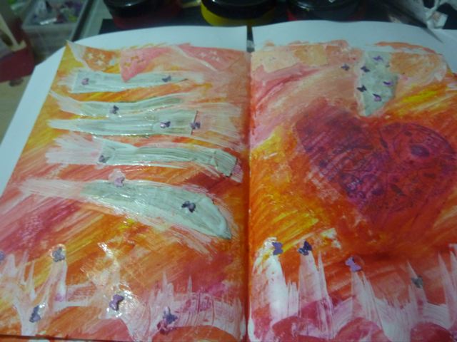
Bt adding dylusions orange and hot pink to sections of the page I began to build up layers. I used some square pieces of plastic to create grids. The grids are faint but you can see them.

 The next day I stamped the Dina Wakely stamp and thought about adding the words Just dandy but I didn't feel just dandy. Next I drew wavy lines across the page and doodled around the lines in white and black. Didn't take photos of this step. My journalling is about the fact I'm fed up with my job and need to do something about it. I am, and that is what I write about in more detail, but its scary and it is like stepping through thin air to my rather tongue in cheek destiny.
Once the journalling was added I doodled some shapes and stamped a Lost and Found dress form on both pages and a bunting stamp around the page. At times the bunting is uneven as the page ripples. I had already added some white lines to mimic the lines in the dina stamp. I coloured the words using a paintbrush and dylusions pink and orange and then just randomly swirled all over the page with the brush.

This is a huge step from the original prompt but it is me and I think I am finding my  style in this journey. Thanks for dropping by.