31 January 2012

A scrapbook page

This page was inspired by the Simple Recipe Prompt on UKScrappers that suggested using pink, brown and grey. Not a colour scheme I would normally use but as it was to use up scraps and I am determined to scrap more this year I gave it a go. I began with the hot pink cardstock background and a grey strip down the side from a TH paper pack. I found the chocolate birds on scrap paper (don't know who made it) and also cut some birds out of that for the birds at the top.
I had covered the birds at the top in glossy accents but didn't like it so swiped with white paint. The flowers were old flowers that I had no idea what to do with and I used some brown ribbon and lace to make the other flower. The journalling describes our middle daughter at a younger age when she was either very good or...
For my birthday my lovely children bought me some metal, metal tools and tape to feed my latest obsession with metal and it came with some mini stamps too...


29 January 2012

Art Journal, GC136: Glorious Green

This is my entry for the Glorious Greens (my favourite colour) at Gingersnap Creations GC136: Colour Challenge here. I have been following some of the prompts on the UKS Art Journey and this week we were to use packaging as inspiration. This was what I found...
We recycle most of our packing so had to root in the recycle bin. Toothpaste, nicotine patches and fly shoes reflects my week. Obviously the colour did not inspire me but the items did and are part of my hidden journalling.I am on week 4 of stopping smoking, the only me packaging is basics as I am allergic to anything with perfume, essential oils, citrus and too many more so no pampering products for me. The pampering was linked to the Fly box as it was my birthday this week and I was spoilt by my family.
I began by using modelling paste I saw in Lidl and spread it with my fingers over a double page leaving space in the middle. I then took a heat gun to the paste and got wonderful bubble texture.
I then journalled in an ever decreasing circle in the middle of the page and traced round the fly on the shoe box using Posca pens and acetate. I coloured the fly with alcohol inks and stuck it over my journalling.
I covered this with scrap paper and sprayed two colours of dylusion inks over the top.
Then it was my fingers and teal, yellow and white acrylic paint.
It was too boring at this point so I used the Birds on the Wire Stamps from Dylusions to cover the space. Because the background was so textured this gave an interesting effect with the stamps. Finally I wrote the word fly all round the border. I seem to have made a very green page again... Thanks for dropping by, I need to Fly now.


25 January 2012

Gothic Arch Challenge

This is my entry for the challenge at the Gothic Arch Challenge blog here. The theme is metallic fever and I have made a Gothic Arch Wall Hanging. After looking around the web at images or original Gothic Arches and finding a template on the Gothic Arch site I traced the template onto some metal and then cut  it out. I wanted a circular shape at the top so after some trial and error I traced and cut out the shape I wanted. I used Pebble, Sunshine Yellow and Red Pepper alcohol ink on the metal.
I then created 3 card arches each a little bigger than the next. I used barn door and wild honey distress inks around the edges and then randomly stamped a paper artsy hot pick flower.
I found some images of butterflies on Graphic Fairy and cut them out and coloured with the colours above and spiced marmalade and then mounted them one on top of the other with pads to give some depth. I coloured a dragon fly charm with inks and stamped more butterflies from Tim Holtz and Paper Artsy onto the Graphic Fairy images. I then added the large butterfly at the front of the arch and gave it some metal feelers and two red bling eyes.
Finally I used some Tiny Alphabets from prima to create the title and added an eyelet and chain.


22 January 2012

A Productive Crop - Scrapping, journalling and laughing


I was at the monthly EK Craft and Crop yesterday and had a wonderful time, I even managed to create 2 and a half scrapbook LOs and a journal page and managed to gossip (I mean exchange fun information) with some lovely ladies. The hardest thing was not eating any biscuits or cakes as I am trying to avoid putting on any weight with my latest attempt at giving up smoking...19 days and counting.
I had taken last year's art journal and my newest one as Suzy is interested in trying out art journalling. It turns out a whole lot of people are interested in this. As I inked and splodged all over my layouts there were various comments about the mess I got into to, created and how it was not for them. Over on UK Stampers we have been discussing how there are no rules in journalling and if you want to be messy you are, if you want to be neat and graphic (see the fabulous graphic pages by Ephemera) you can be. The subject of what you journal is also fascinating and again we agreed you either do or don't. This is a bit of a ramble here but I am going somewhere with this. My biggest problem with scrapping has always been there seems to be rules and I always felt I was getting it wrong somehow. Yesterday I had this moment of insight (or madness) and agreed with Suzy that we don't need rules and why should it always have a title or journalling? I then happily created 2 and half pages that are heavily influenced by my art journalling adventures. I also bought some beautiful seam binding from Angela of Angel Crafts who brings her shop to the crop and some prima resist canvas (and nothing else if you are reading this Lens Guy...)
A little about the LOs. The first one shows our middle daughter aged about 8 (we never dated our old photos...) and my dad. I cut out out the blue cardstock using a borrowed stencil and then added some TH Kraft resist in the middle which I swiped with dylusion ink using a baby wipe. The title was also swiped with ink and the letters were a Prima Lush set.
This was layered onto a gutted piece of Kraft card. I stamped compass, binoculars and text from a Royal Langnickel set, added distress inks and then journalled. I used two beautiful colours of seam binding to provide a frame and a piece of the canvas resist.
The next layout shows our youngest daughter aged 3 or 4 following my brother-in-laws pet sheep back up to their house. I used a lost and found page and spritzed it with dylusions and distress inks. 

A piece of 7 Gypsies card as a photo mount and then used seam binding to create a flower and ribbon strips. I also added a lovely piece of lace. The title was Tiny Alphas from Prima.
Finally and sorry it's such a long post... the journal page began with Claudine Hellmuth foam dot stamps and then I added Studio 490 Steampunk stamps and Lady Audrey from Octopode. There was a lot of ink and acrylic paint here too. The journalling sprung from the conversations we were having yesterday about how art journalling is scary and messy.

 The little feet shape marks beside the boot were from a decorative easter chicken Betty was making tags with but she took the feet off and Anne suggested I should use it so I stamped them on.
Thank you for taking the time to read this and I always appreciate the comments people leave, although Blogger is back to being a little huffy at the moment.


15 January 2012

Wall hanging

I am setting a monthly challenge on UKStampers hereThe challenge for this month open until 11th of February is to..."Use Metal, Material from old clothes, tissue and stamps to create a wall hanging. As is it January and it's a long time until payday you can't buy anything new - existing stash only."This is what I began with.
I always have a huge amount of jotters to carry to an from school and I had been using an M&S canvas bag featuring twiggy until it developed a huge hole in the bottom. I have used on side of the bag to form the top of my inking apron (more of that another day) and decided to use a piece of this and because it is such an iconic face to to use the Face but the mouth was a victim of the bag breaking. I had recieved an Art From the Heart parcel recently so used the red tissue paper from that to recreate her hair with texture and give her a more modern haircut.
I then decided to paint all over it with gesso as I wanted to change the colour...
As part of my Christmas money spending I had bought the Paper Artsy Grunge flower die and the Hot Pick HPXT02, partly because at some time in the past I had bought some metal and had no idea what to with it. I later discovered I should have brought tape and stuff too but improvised.
I cut out out the flowers and stamped them with purple stazon and then decided I wanted to add alcohol inks but forgot about mixing stazon and inks. The flowers looked great but I removed most of the stamping. This is one of the flowers I made using the silver but in the end decided copper tones would  work better. Daughter wants this as a brooch.
I then took Claudine Helmuths dotty stamp from the domestic set and stamped a blue Dylusion background that I highlighted with black posca pen. I applied pink and purple dylusions to the hair with my fingers and then painted on some very scary eyes. I wanted to change the face and make her something else which she certainly is - a little scary I think. Daughter came in and asked if she could have the hanging for her room as seems to be delighted with it. Here is the bronze flower.
I punched holes and set eyelets with the cropodile and then used some of the idealogy chain I won for entering a Tim Challenge on UKstampers. If you would like to enter the challenge (which is monthly) please pop over to UKStampers, it is just for fun and no prizes but already some of the pieces in the gallery are fab.


11 January 2012

Art Journal Page

 These pages have a simple sprayed ink background and my new stamps from Paper Artsy, Hot Picks HP1109. I used Dylusions burnt orange and blue sky for the background and added some extra colour to images using jade green.
I highlighted parts of the images and completed my journalling using a sakura white gelly roll pen.

 It was a horrible cold wet day which inspired the journalling.


8 January 2012

Gingersnap Creations GC133: Chestnut Theme Challenge - Use a Set

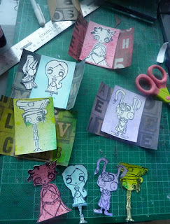
This is my first entry for the Gingersnap challenge but when I saw the theme I thought of  my new Alice Octopode Factory stamps. I created these ATCs for a swap on the Alice theme on UK Stampers. I had seen an example of a Triptych ATC and decided I had to try it.After working out how to create the Triptych I cut out some of Tim's Holtz's festive craft paper and then stamped each image onto cream card. I then created masks for each stamp and sprayed each card with a different colour. I used Dylusions Inks for the Queen and Mad Hatter and Cosmic Shimmer Chalk inks for Alice and the white rabbit page boy.
I am going to use the masks for another set of ATCs as I like how the colour went on them.

I used a key charm, pearl brads, ric rac and part of an old necklace to decorate the front of the white rabbit ATC.

 For the front of the mad hatter I cut out the watch face and tape from a sheet of lost and found and added liberal amounts of crackle glaze and ink.
 Because I kept thinking of the Looking glass and Alice I used some metal to cover the front and inside of her ATC. I added the eat me and drink me stamps from Octopode.
 You can see more of the front of the Queen in these photos. I coloured roses red (of course) and added red velvet ribbon and hearts cut from paper and stamped crowns.


4 January 2012

It's Finished - 2011 Art Journal

At times I never thought I would finish this. When I agreed to enter the weekly challenge on UKStampers to create an art journal I did not know what I was letting myself in for. I have loved every minute of this process and have learned a great deal in the process but still feel I have a long way to go. I learnt that I favour colours in green and purple area of the colour wheel but also liked a little orange and pink. I used two pieces of cardboard from the back of note pads to create my covers by doing this...
After placing a layer of gesso on the cardboard I used my fingers (and hands) to apply teal and white dylusion paint. Lens Guy came in during this process and commented on the fact I was making a lovely guddly mess. He was quite right and that's what I have enjoyed about this process as I don't think there are any right or wrong ways to journal. I have loved some of my pages and others I have not been so happy with but that is all part of the process.
As green, orange and pink featured in the journal I decided the cover needed to reflect that. I had made the tag earlier this year using Dependable Dotty stamps from Dylusions but did not know what to do with it. Does any one else have that problem. I had some scraps of the glue resist background left and drew and cut out the words art journal. The little bit of orange ribbon links to a journalling tag at the back summing up the process for the year.
I have now bought a journal to journal in as when I started this last year I just used random sheets of paper that were approximately 9 x 7 inches. It was meant to be 6 x 4 but that seemed too small to contain my messy splodges. Having now started journalling in a book it is easier to contain in a book but means  less unusual backgrounds to work on unless you stick them in but I could do that as there are no rules. Did I meet my goals I originally set? Yes apart from the smoking one... I stopped and started twice last year. I have stopped again (only just) but know that I am a bit of a repeat offender especially when stress at work gets to me. I thought I would share some of my favourite pages this year.


Thank you for dropping by and scrolling down through all these photos. I am going to keep on journalling this year, try and do more scrapping, learn to quilt, do more altered art and just have fun...